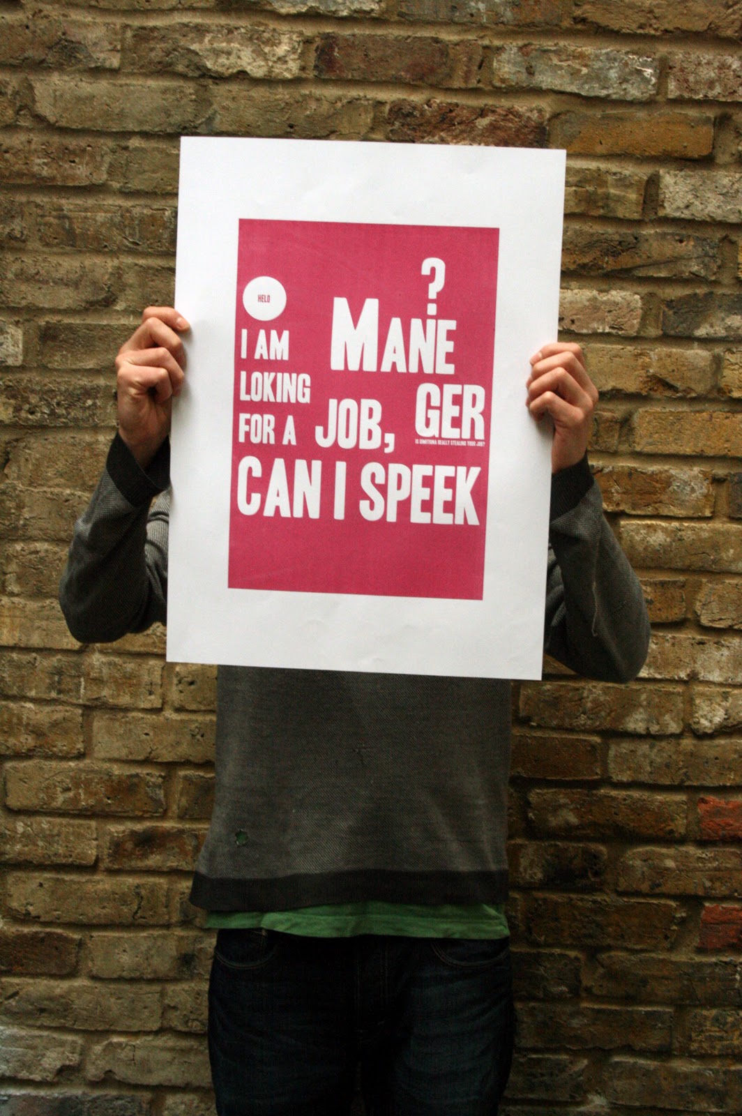
This is a very small selection of the excellent work that is currently displayed at the London College of Communication. The work is from final year students of the course that i am on. Uff, the bar as been set really high i have the feeling. Next year will be us, organizing and exposing at the exhibition. Start your journey into the work here, or, alternatively and highly recommended, pop up there. The exhibition will last until the 8th of July.
Showing posts with label Typography. Show all posts
- Singapore airlines ad
This, my friends, is what i consider to be great graphic design. Simple, clean, elegant. Simple animation techniques, beautiful effect.
By the way. It was done by the whynotassociates studio.
- Time shift workshop
So, as we were proposed in the Time shift workshop, i started to document the life in my fridge. Each day i would make around 8 different pictures, from the same angle of the refrigerator (i didn't find another way of not repeating the word fridge- i mean, refrigerator). But... on week two, my flatmate decided to clean it - you know what iam referring to...
So, well, week two never started.
- Typeface done
So, based on the Elephant and Castle shopping centre and the available time i developed this typeface. It obeys a series of rules, it takes time and can be a bit irritating at some moments, but when things start matching up is really a great pleasure.
- Designing a typeface
So, as part of the vernacular typography workshop, i ended up doing something, that indeed doest not quite match up (just yet) with the examples of Mike Perry. But this was the idea that i had in class, Katy approved it, so i continued developing the idea at home. I've drawn it based on the rules found on the Elephant and Castle shopping centre logo. (You you are wondering why did i pick up such a grrrrrr logo, it's because it needs to relate to the area, and the design in the area is... let's say, strongly identifiable).
Most of all, and that is the reason why i stoke (the past of sticking) to the idea was because i really enjoyed the process. I am at half way to what i visualize as the end of the development. Now i want to bring these measurements into illustrator, and build it digitally. Wasting too much time on this though...
- Concept challenge
Today i went for the third time to Marylebone high street and photographed. I had a plan. I had a list of things to photograph. It's a great experience, you feel really professional. It's time effective, and very productive. You understand what i mean...? Instead of just going and making some pics without knowing exactly what to shoot, you go with a plan. Give it a try.
- There
Found this while doing some pictures around temple. Around 5 o' clock. I agree, i am to close to the X, but i'll go back there.
- Design application test
In a moment of crazyness, at the last minute i though about changing the typeface that i had selected as part of the identity of Bankside & Borough. No, i'll stick to the first one, Museo. The other one, if you are interested is Admark. Copy and "subheading" are set in Frutiger Light in both cases. The logotype, by the way, if Frutiger Bold. This piece is supposed to work as a double page spread, as an advert for billboard, or any kind of landscape poster. I made a series of 4, will post them soon. Scary, Spicy, Catchy and Easy. They all finish with an "y" you noticed... The answer, "y"not? (who is also the studio with whom we worked on this project)
- Street type
- When the tool shapes the product
" ...the marking properties of a brush, reed pen, and stone engravers chisel, influenced the early form of the alphabet. The reed pen, used in ancient Rome and the medieval monastery, was held at an angle, called a cant, to the page. This produced a pattern of thick and thin strokes... "
Typographic design: Form and Communication. Second chapter. By Rob Carter, Ben Day and Philip Meggs.
- I have a plan!
This image is a snap shot of the idea that i had for my current project. I have very little time. But i'm cool with it. For the first time in my life (well, at least as a designer) i am close to a deadline, i don't have the work ready at all, and i am not stressed about it. It feels great. This project has been a funny one. I didn't really wanted this one but that's the one i ended up with....
Then...
I missed the briefing, i was in Barcelona. Then it took me forever to be able to understand the brief. Then i went to quite a few exhibitions, galleries, museums. And websites. I met the ICA from the inside. I was in a talk with one of the architects responsible for the new entrance design (without the glass box).
Ideas would not come. Well, they would, but the stepping stone process from there seemed always impossible. I presented my ideas last monday to Jo (our tutor on this project) She liked them but.. I knew i had to develop one of them further and focus only on that.
So, instead, i worked on the presentation of the research. Did nothing to develop one of the ideas further. Today i havent done it either up to around 11pm. I redecorated my living room. With my flat mates. And i went for dinner with my sister. And i watched Barcelona against Arsenal. And i didn't stress about the deadline.
Suddenly, i found a way, that responds the brief, well (in my opinion) and that might still be able to completed by 80% until next Monday, date of final presentation. It was in fact, one of my original ideas that broke with the status of "impossible".
This "corridor" bubble is not just a bubble but for now i prefer not describing the idea further than this.
Tomorrow... loads of work to do.
See you
- ICA project
What started as a really promising boring project, ended up actually becoming quite cool.
These are two of my ideas for the ICA project. On the first, i propose the wall to be painted. There are 9 stripes, the same number as spaces inside the institute. I believe that this could work out well, as a first step in the task of enhancing audience participation. (my target audience are passer byes, mainly tourists) This would then break the ice on the approach to the foyer (first gallery space you see yourself in when you enter). On another side, tourists would have a place where they could photograph themselves. Free publicity for the ICA in all of those Facebook "London Albuns"
The other idea is to completely get rid of the metallic sign. It looks terrible. I describe it as a hospital or school, or factory sign. It isn't contemporary, it doesn't read experimental, not beneficial whatsoever. So i propose that instead of removing it - let's take in consideration the limited budget of the ICA - we recycle it. It could merge with those 4 metallic poles that are doing nothing, and become both a sculpture and a bicycle park. To make it more attracting, an old, big wheeled bicycle would be chained there...
- Recommended book
Guys, this is a book that I somewhere found, recommended by Darren. It is (obviously) available at the LCC library. I started reading it because i was told of lack of typographical research on my last project - Bankside and borough rebrand - by Paul. That's not really true i said. Well, the fact is that it made me take a step in a good direction and instead of just staring amazed at works, start looking at things in a more detailed way. From it, i specially recommend, chapter 3 - Syntax and Communication.
- PPD mini-portfolio
So, today is the first of March, and also the day to deliver the mini-portfolio as part of the PPD assessment. I delivered mine. I wasn't able to finish it, as it really needs to be at the time of looking for a work placement. I know it. And i also know its a summative assessment and that from there, i won't get the greatest of the marks. But, i am happy having done it. I created my structure, my style and my ideal approach. What i need to do now is to reaaaally start polishing it.
- The identity application
So, today is the first of February. The project continues and as i cannot decide on a logo, the idea is to use it on the different possible applications, and then chose. Here is one, a magazine, full sized page advert. I could have worked out the copy better, but it is really more just to have a look. I like it. I like my Museo Sans, hihihhi...
- Further development of logo
This is the stage i am on my project. Research is definitely over.
The bolder version of the logotype is Frutiger typeface. A corporate alternative to the faceless Helvetica. The other, is Museo Sans. I like it. It might have to much style which could end up being a problem at later stages. But, i like it. To me it says Borough and Bankside. The area.
Concerning the mark, there are two routes i could follow. One is where the colors don't overlapse, more squared, more urbanist. The other is where more about diversity, arts..
And i am not to sure which route to go...
Subscribe to:
Posts (Atom)